Back to Insights
Considerations When Designing UX/UI for Foldable Mobile Devices
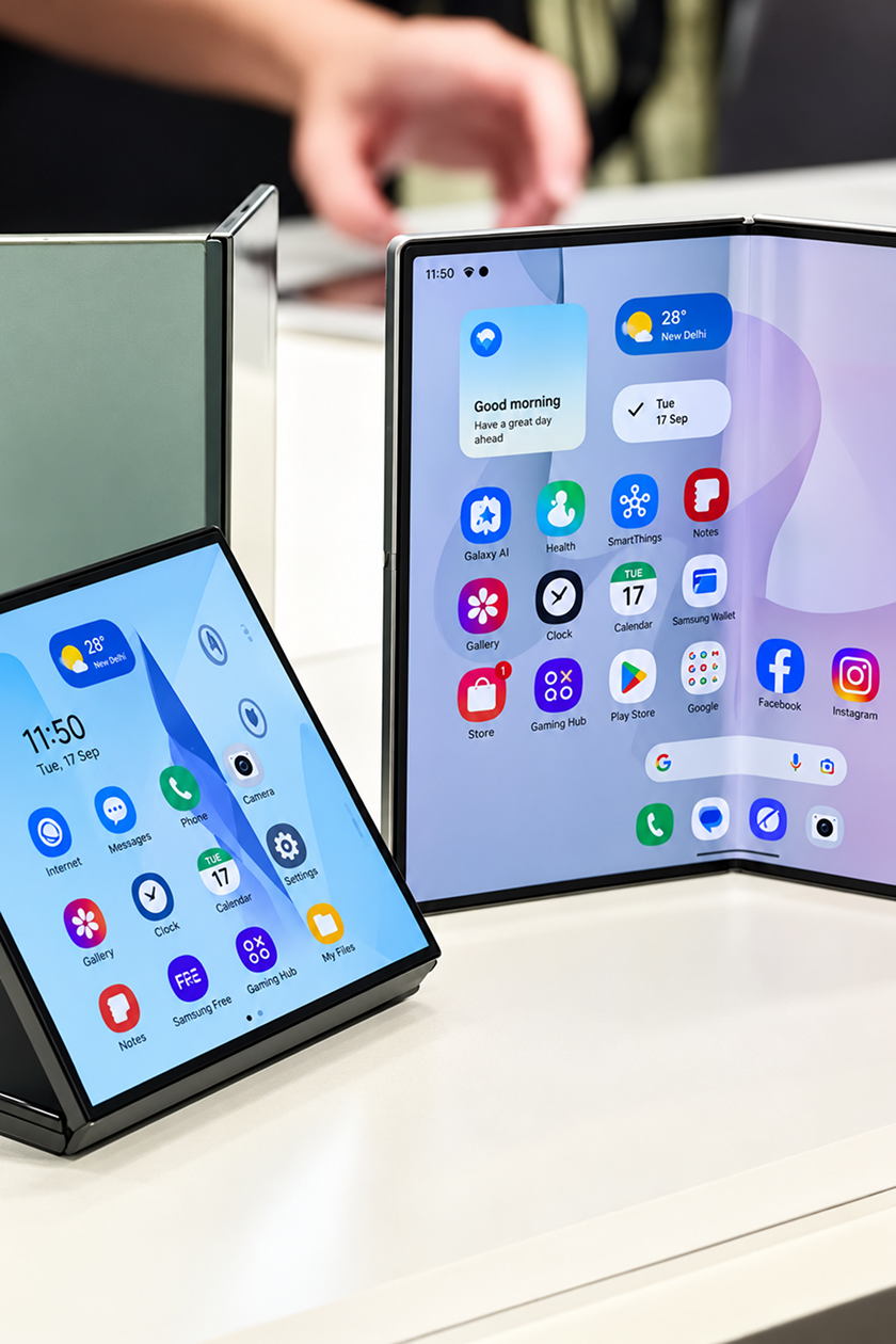
Foldable phones are becoming harder to ignore. Samsung now has the Galaxy Z Fold8 and Flip8, Google recently introduced the Pixel 11 Pro Fold, and Apple has entered the space with the iPhone Duo.
For designers, this brings a slightly different challenge. We are already used to thinking about mobile, tablet and desktop screens. A foldable, though, can change while someone is using it. A person might start something on the outer screen, open the phone halfway through, rotate it, or use it partly folded on a table.
So when working on UX/UI for foldable devices, there are a few extra things to keep in mind.
The layout needs to move with the device
One of the easiest mistakes would be to treat the larger inner screen as a stretched version of the normal mobile screen. There is more room, but that does not mean everything simply needs to become wider.
Sometimes the extra space can actually change how a task works. An email app could keep the inbox visible while opening a message beside it. A shopping app could show the product list and product details together. In other cases, the normal layout may already work perfectly well.
Apple gives a useful piece of advice here:
“Design your app to be freely resizable and you'll be in good shape.”
Apple also recommends avoiding layouts tied too closely to a particular screen size. The idea is to let the interface adjust naturally as the available space changes.
A simple test can tell you a lot. Start a task with the phone closed, then open it while the task is still in progress. Does everything move naturally? Does the user stay in the same place? Or does the change make the experience confusing?
The fold itself cannot be ignored
The middle of the screen also needs some thought. A button that feels easy to reach when the phone is flat might become awkward when the device is partly folded.
Apple’s guidance shows controls moving away from the centre when iPhone Duo is folded, while text and images also adjust so they remain easier to view.
Navigation can change too. A bottom menu may make sense on the smaller outer screen. Once the phone opens, there may be enough space for navigation on the side or for more content to stay visible.
That does not mean creating a completely different interface every time the phone changes position. The app should still feel familiar. People should not have to work out where everything went simply because they opened the device.
Testing needs to cover the change, not just the screens
With a normal mobile design, we often check how the interface looks at different screen sizes. With foldables, it is also worth checking what happens between those states.
What happens when someone opens the device halfway through filling a form? What happens to a video when the phone is partly folded? Does a menu stay easy to reach after the screen changes?
These are small details, but they can make a big difference to how natural the product feels.
Foldables do not mean starting UX design from scratch. Most of the basics remain the same. The difference is that the screen is no longer something we can assume will stay the same throughout the experience.